Tips for Choosing the Ideal Picture Frame Colour
Picture frames don’t just hold your pictures in place, but they also enhance and complement them in a way that brings them to life. The right colour can enhance the beauty of the artwork, enhance your home décor, and even evoke emotions that make your photos stand out. Read on to discover some tips for selecting the perfect colour, ensuring your treasured memories and artworks get the spotlight they deserve.
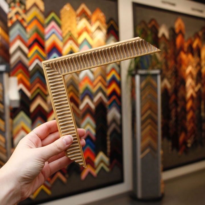
If you happen to live in Brisbane, opt for this Brisbane framing service that delivers straight to your door. They offer ready-made designs, available in various sizes and finishes, including oak, black, and white. If you’re looking for something unique, you can upload a photograph, choose a frame style, and leave the rest to them. They even create made-to-measure designs tailored to the exact dimensions of your artwork.
Analyse Your Photo
When it comes to selecting the right frames in Brisbane, the first step is to analyse the prominent colours and tones within the picture. This foundational step helps you determine which colours to focus on when making your decision. By paying attention to these key hues, you can choose a design that not only complements the image but also enhances its overall appeal.
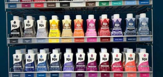
A handy tip for this process is to use a colour picker tool, which you can find in most photo editing software. This tool allows you to precisely identify the dominant colours, so it’s easier to see which shades you should highlight or match. By using the colour picker, you can ensure that the design you choose will harmonise with the photo and draw attention to it rather than overshadowing it.
Taking the time to analyse the colours helps you select a complementary frame and ensures that the finished piece will look cohesive and well-thought-out. This attention to detail can make a significant difference in how people perceive your photo or artwork, creating a visually appealing and polished final product.
Pick a Complementary Colour
Once you’ve identified the prominent hues in your image, the next move is to find a Brisbane framing service that offers these colours. The aim is to find a design that complements the photo, bringing out its best features. For example, if your photo features warm tones like reds, oranges, or yellows, opting for a frame in a warm colour such as gold, oak, or maple can create a cohesive and inviting look. These warm designs can enhance the richness and vibrancy of the photo’s colours and make the entire piece more visually striking.
On the other hand, if you’re working with a Hamptons style piece that’s dominated by cool tones like blues, and greens, a frame in a cool colour such as silver or black might be the perfect choice. These cooler colours can highlight the serene and calming aspects of the piece, which provides a balanced and polished appearance.
Consider Your Photo’s Mood
When browsing through picture frames in Brisbane, it’s important to consider not just the colours but also the mood and style of the image. The frame should reflect the aesthetic and emotional tone of the image, enhancing its overall impact. For instance, if it has a classic or retro vibe, a wooden frame might be the perfect match. These can add some timeless elegance that complements vintage or traditional styles beautifully. On the other hand, if your photo embodies a modern or minimalist aesthetic, sleek and simple designs can provide a clean and sophisticated look that doesn’t detract from the image.
If you’re looking to add a special touch, consider a coloured frame. These can either highlight one of the dominant colours in your photo or provide a striking contrast that draws the eye. By thoughtfully selecting a design that matches the mood and style of your photo, you create a cohesive and engaging presentation that enhances the viewer’s experience and underscores the photo’s intended emotional tone. This careful consideration ensures that your photo will not only look great but also feel right.
Experiment

When choosing custom frames in Brisbane, it’s a great idea to experiment with different options. One way to do this is by using an online configurator. By uploading your image, you can play around with various colours and styles to see which one complements your photo best. The configurator allows you to view all options in real-time, either as a 3D model or displayed on a graphic wall, giving you a clear and immediate sense of how each design will look.
This process helps you visualise how different colours enhance or contrast with your photo, so you can make an informed decision. You might discover that a colour you hadn’t initially considered brings out the best in your image, or that a certain style perfectly matches the mood and tone of your photo.
Go with Your Gut
Sometimes your intuition is the best guide when choosing the perfect frame colour. It’s important to select a hue that not only complements your image but also resonates with you. Trust your gut and pick a design that pleases you and conveys the emotions you want your photo to evoke. When a frame feels right, it will enhance the beauty and impact of your artwork, creating a piece that truly speaks to you.